What is above-the-fold content?
Above the fold content is a reference to the top part of a website’s page: the element of the site that you see before having to scroll. The terminology comes from a newspaper reference where the most important titles and information would be immediately visible to consumers on sales racks.
People don’t act until they know what to do to solve their problems. When you have effective above the fold content on long-form content, such as blog posts, landing pages and sales pages, you’re creating the foundation that leads to an eventual click when someone encounters your call to action.
5 practical above-the-fold improvements for your webpage
If your conversion rate isn’t where you’d like it to be, the following above-the-fold improvements can help your website present information more efficiently for each visitor.
1. Improve your information quality
There are two types of above-the-fold content; firstly, ‘the sell’ and secondly, ‘the introduction’. Each has its own uses and reasoning.
The Sell.
These are sales pages that are designed specifically to elicit a sale.
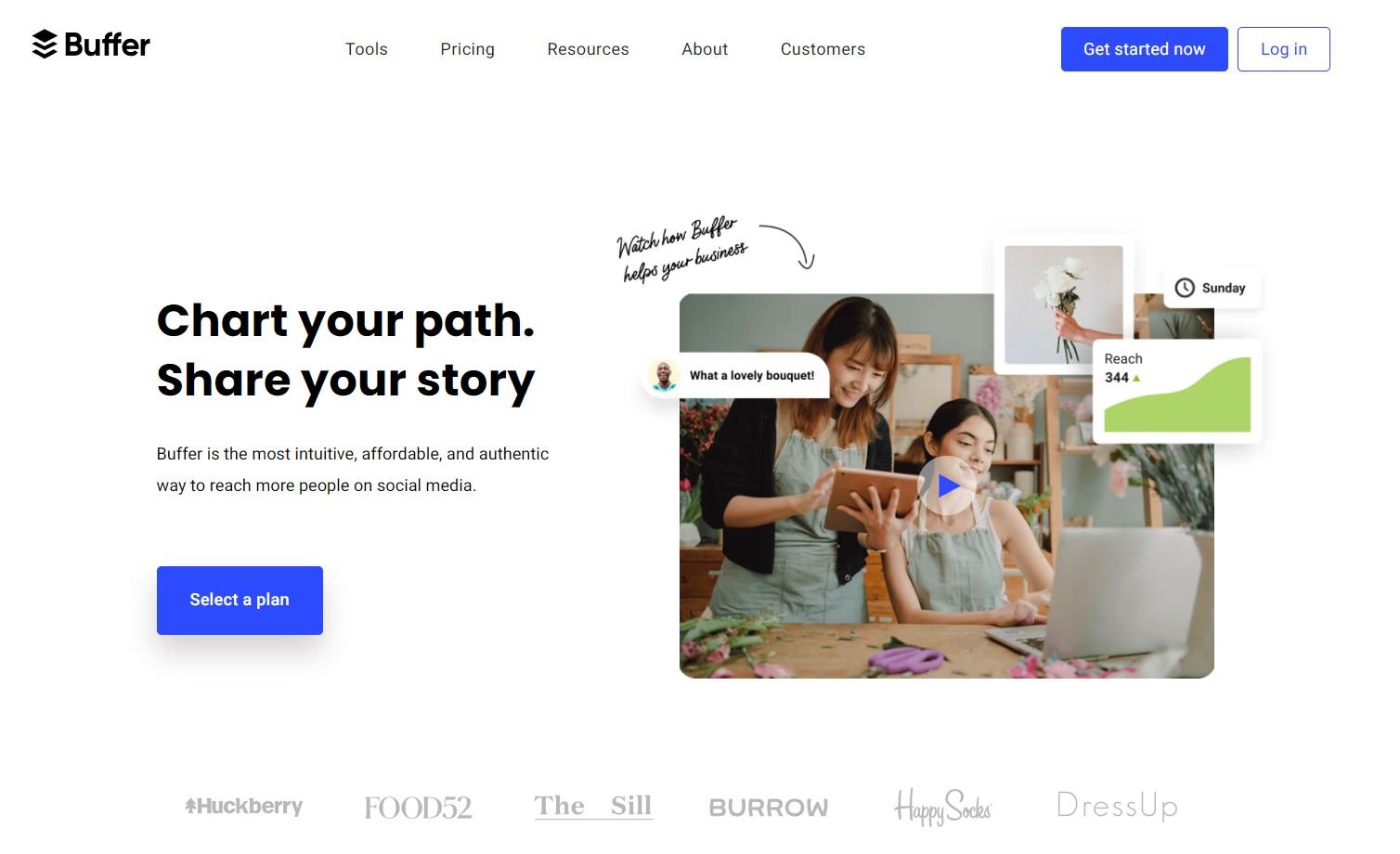
If we look at this example from Buffer.com you can see very simply that their home page has been set up with one very clear call to action: your purchase of one of their software plans.
You can see Mailchimp use exactly the same technique, showcasing a comparison of plans as a backup option, for those still undecided.
In both instances, if I were to scroll down, the pages are filled with reason after reason why signing up will solve my relevant issue. The reason why none of these later information points appear before that invisible fold line is purely because they are aiming for the sale as your call to action, not the scroll.
The Introduction
For those purchases that are more expensive, or more complicated you will find sales pages can be quite long. For example, my retainer services page is quite lengthy, although concise and necessary given the scope of the service offer.
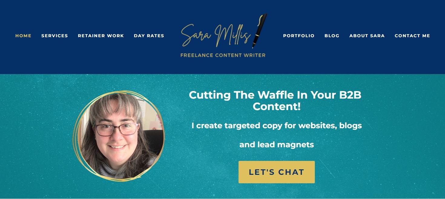
Above the fold, I still have the main concept of ‘The Sell’ with my discovery call button, but I’m actually using this specific area as an introduction, leading my potential client through a series of information to help them determine what they need, without overwhelming them.
In this case above the fold content is meant to serve as a prelude to the rest of a sales page. Think of it as the thesis statement that sets up what the website visitor should expect when scrolling.
If the call to action on your landing pages is overly emphasized above the fold on these bigger purchases and investments, it may turn some customers away – unless they came to that URL for a specific transaction. Site visitors may need a little warming up before they make their purchase, so having long-form content underneath that details the benefits of and solutions your product or service offers is crucial.
This may mean that you need to consider a secondary, or even a tertiary call to action button below (maybe differently worded, but the same link).
An introduction style area can also be used on every page of your website, even the pages that do not have a typical call to action. Pages include blog posts, where you are setting the reader up for the topic at hand, or on about pages, where you wish to precis your website, or brand’s key information.
Remember that reams and reams of text to read can be difficult to digest and off-putting, so breaking up your content is important, and you can achieve this with line breaks, segmenting elements of information and using code to create colour blocks, markdowns or accordion-style FAQs.
What goes above the fold is the introduction with a call to action (a link, sale, or the idea of scrolling) and then what is detailed below can be the more meaty content, intent on helping your buyer make final decisions. That’s why A/B testing is often necessary when developing page structures. You’ll get a better understanding of what visitors want to see and the layout of your page as a result.
2. Eliminate the sliders from home pages and sales pages
When content sliders made their debut around 2004, it was an essential website upgrade because it allowed consumers to access more information on home pages and sales pages. If you place one above the fold today, the moving graphics could detract from your message.
The Internet has evolved significantly over the years. People want to scroll more than click on different slider windows. Google also takes note of changes in user intent and so they can often mark a website’s ranking up or down based on their understanding of preferred user experience. This means that most website owners will be replacing slider information over the next year or two if they haven't already.
Think about your most important information to share. That content is what should be above the fold today. Changing home pages often if you are in eCommerce is crucial to keep your website feeling fresh and highlighting important products within your offer.
3. Avoid using large images
Having an image of significant size above the fold can look attractive and be appealing to some visitors. It also tends to negatively impact the loading speed of landing pages and mobile views.
If you’re investing in an SEO marketing campaign, or want to achieve more traffic with your home page, then incorporating this visual element could adversely counter the other efforts you’re making to improve the user experience.
When you need a header image to get your point across, try using it in the background with CSS instead of opting for HTML. The page speed won’t be as affected as much by that effort.
You can see this is what I have done on my own home page. I also use code to make sure that this image does not show up in the same way in all formats (desktop, or mobile) and this helps me to avoid my call to action message being lost in too much noise, especially when screen sizes can get smaller.
4. Be specific with a call to action
When a call to action makes sense for your web page, it should be a specific instruction that a visitor can follow. There should be no ambiguity because a confused internet user is someone who goes to a competitor. Try adding a few lines of text to support the reasons why you have something valuable to offer. You can address potential problems, be empathetic, or deliver evidence that shows you’re the best.
Without compelling above-the-fold content and copy, website visitors won’t be tempted to click, or scroll. Be as authentic as possible while keeping things short and simple to get the best results.
5. Keep your navigation options visible
Most people look for information about products or services after reaching a landing page. A majority of consumers want access to contact information. Without an intuitive user experience design (UX design) that stays accessible above the fold, those needs won’t be met.
Sometimes this means having your entire menu visible on that particular landing or sales page and sometimes it means hiding what you do not need in the HTML code of your web page.
When you take care of your above-the-fold content, the rest of your web page becomes an asset. These steps can help you create that result right now.
If you need a copywriter to create compelling copy, someone who understands the customer journey, fill in the project brief form below!


